Hazaar
Introducing brand partnerships to Hazaar's student-only marketplace app
Team
1 Designer
4 Experience Managers
My Role
Visual Design
UI & UX Design
Industry
Travel
Duration
8 weeks
About Hazaar
Hazaar is the UK’s first student only zero-waste marketplace, aiming to make sustainable ways of living accessible and fun for young people. Throughout my time at Hazaar, I have incubated and led a number of projects to mature the app experience beyond their initial MVP.
Over time the brand has evolved to have a B2C and a B2B component, working with universities to deliver waste-reducing solutions to campus. They have recently started branching out to partner with brands too, preventing off-season garments from ending up in landfill.
The challenge
How might we introduce brand partnerships into the mobile app without compromising the existing student seller experience?
Requirements
In order to close deals with brands, there were several requirements that were needed to implement in the app.
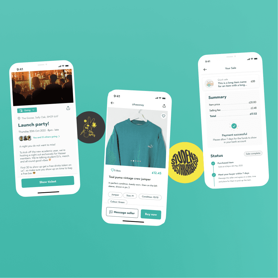
Verified seller identifiers
RRP
Merchandised tiles
Time-dependent notifiers
Dedicated brand destination
All of these components were agreed collaboratively with prospective brands, the Hazaar team and design to incubate the MVP brand experience in the app.
Key challenges faced
Some key challenges in this process included injecting new elements to the design in a way that was easy for users to understand, adapting existing student listings to maintain consistency with new elements for brands, and working around the existing information architecture to accommodate for brands which aren't bound by category.

Design exploration
Due to time constraints, a hackathon style design sprint was conducted to rapidly research, ideate and deliver designs based on the requirements, existing design patterns and technical limitations.
A process of competitor analysis, identifying user needs, rapid ideation and collaborative reviews helped to refine ideas at a fast rate.

Outcome
As a result of multiple iterations and collaborative decision-making sessions with the wider Hazaar team, we arrived at a new strategy for brand implementation which is functional, yet enticing. It is woven into the fabric of the existing app structure to cater for Hazaar's strategic shift towards brands without overriding other elements in the app.

Key design decisions

Several approaches were explored to distinguish between the different types of users on the platform.
Using a simple tick inside a green rosette aligns with the brand as well as design patterns in other apps such as Instagram.

A simple card overlay design was implemented to enable users to select different sizes and colours. This is aligned to the filtering component in the browse experience, therefore maintaining consistency throughout the app.
In order to distinguish a brand's shopfront from a standard user, a new card design with a gradient background creates a visual distinction whilst still maintaining the Hazaar brand.
A key challenge with integrating brand tiles into the home screen is that they are not bound to a particular category, however the top-line navigation of the home screen has category chips along the top.
To maintain consistency without binding brands to a category, a sticky chip rail on scroll was implemented to balance both needs without sacrificing any elements of the existing experience.
Two card variants were also created to illustrate a 'live' versus 'coming soon' brand, which helps create anticipation for an incoming brand launch.
Other projects at Hazaar
For the time I worked with Hazaar, I was the only designer on the team and was solely responsible for the evolution of the app (post-MVP). I worked on several projects to help shape the digital strategy of the brand and evolve our experiences as the business grew.
Browse experience
Hazaar's offering is grounded in the idea that each university has it's own marketplace so that students don't have to pay postage and packing when buying items. This segregation of items means that when launching at a new university, there are a low number of listings.
A big part of this work was to enhance the approach for the browse pages to make it as easy as possible to not only search for items but also discover items to increase engagement. This resulted in a restructure of the browse page and introduction of curated lists.
Buy and sell
When users purchase items through the app, they meet up in person to exchange items and complete the sale to reduce waste and emissions from postage and packing. The MVP experience was functional but wasn't providing the best experience.
Along with this, Hazaar began offering in-person events to students to help build communities on campus. This meant having a cashless, app-based mechanism to enable students to buy and sell in person, as well as through browsing in the app.
Optimising onboarding
A user pain-point experienced at in-person events was the time taken complete a sale if they are a new user, because they would need to type in their email on the spot and make an account.
My responsibility involved auditing the existing journey, conducting and analysing usability tests to understand opportunities for improvement, and redefining a new onboarding journey to cater to our users who are under more time pressure to access the buy & sell feature.
Information architecture
The MVP app exhibited the very fundamental functionality needed for the business to operate, but as the service and its offerings grew in scale and complexity, the IA of the app no longer aligned with the direction of the business.
My role involved aligning with Hazaar stakeholders to understand short and long-term future states to future-proof a reimagined information architecture.
Website redesign
As Hazaar started gaining traction with universities across the UK, the website experience felt outdated and misaligned with the look and feel of the app and their social media presence.
I was responsible for re-designing the website to appeal to a B2B and B2C audience base. This included redefining the information architecture, copy writing and content design.
& more…
Working on an ever evolving product meant that every element of the app needed considering. We even implemented features, such as an events space, due to the business exploring this route as an offering, but has been removed as a result of a change in business direction.
We have been very responsive as a brand to rapidly iterate to test and learn as we go along, instead of dwelling too much on perfectionism, which has ultimately resulted in an award-winning business.