
NatWest: Spending Subcategories
Role
Product Designer
Team
3 Experience Managers
Timeline
2 months
Skills
UX Design
UI Design
Brief
Improving clarity and confidence in everyday financial decisions

Challenge
Designing for trust in a highly data-driven environment
While transaction categorisation already existed within the app, several challenges limited its effectiveness:
Users struggled to understand why transactions were assigned to certain categories
Manual recategorisation was possible, but unintuitive and under-used
Inconsistent patterns across the experience increased cognitive load
Trust in the accuracy of insights was low, reducing perceived value
From a delivery perspective, the team also needed to work within the constraints of an existing third-party categorisation system, limiting control over underlying logic and data accuracy.
The challenge was not just to redesign UI components, but to create a clearer, more trustworthy experience that worked within real technical and regulatory boundaries.

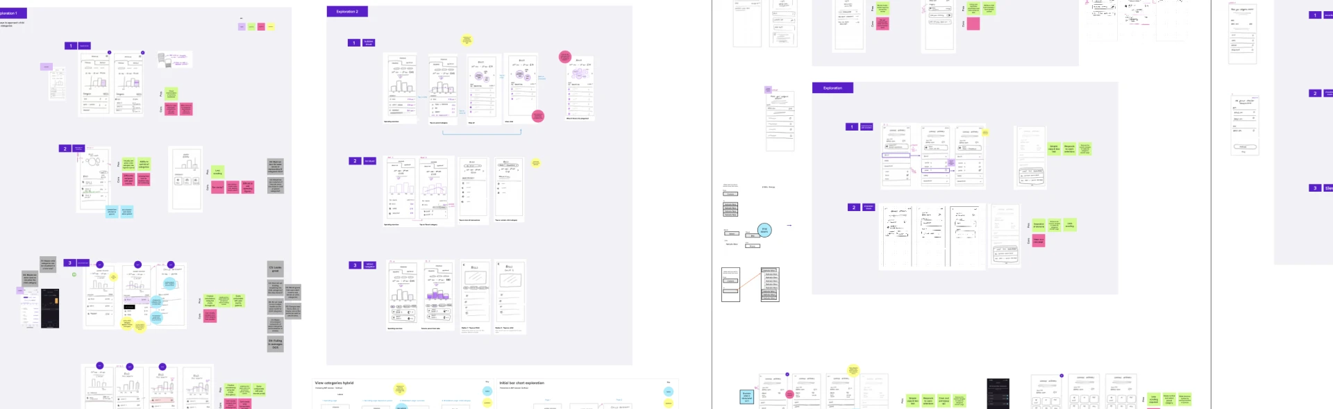
Discovery
Understanding how people interpret personal finances
We began by reviewing the existing experience end-to-end, mapping key user journeys such as:
First-time exposure to spending insights
Reviewing spending by category
Manually re-categorising transactions
Setting and monitoring budgets
Alongside this, we explored competitor patterns and internal research insights to understand how users mentally model their spending and what signals increase trust in financial data.
This discovery phase highlighted a key tension: users wanted both simplicity and accuracy, while the system itself operated with inherent ambiguity. Any solution needed to acknowledge this without overwhelming users.

Key decisions
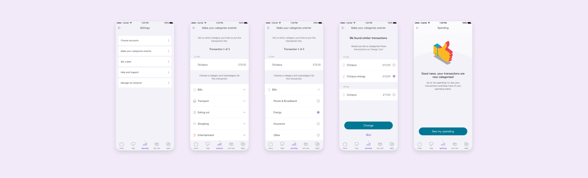
Improved onboarding flow
We consolidated fragmented categorisation flows into a more coherent experience, reducing unnecessary variation and helping users build a consistent mental model of how spending data worked across the app.
This meant prioritising predictability over bespoke interactions, even where more complex options were technically possible.
Designing for trust, not just control
Rather than over-emphasising manual controls, we focused on improving transparency through clearer labels, supporting copy, and subtle guidance patterns. The goal was to help users understand why a transaction was categorised a certain way, not just change it.
This reduced friction while reinforcing confidence in the system.


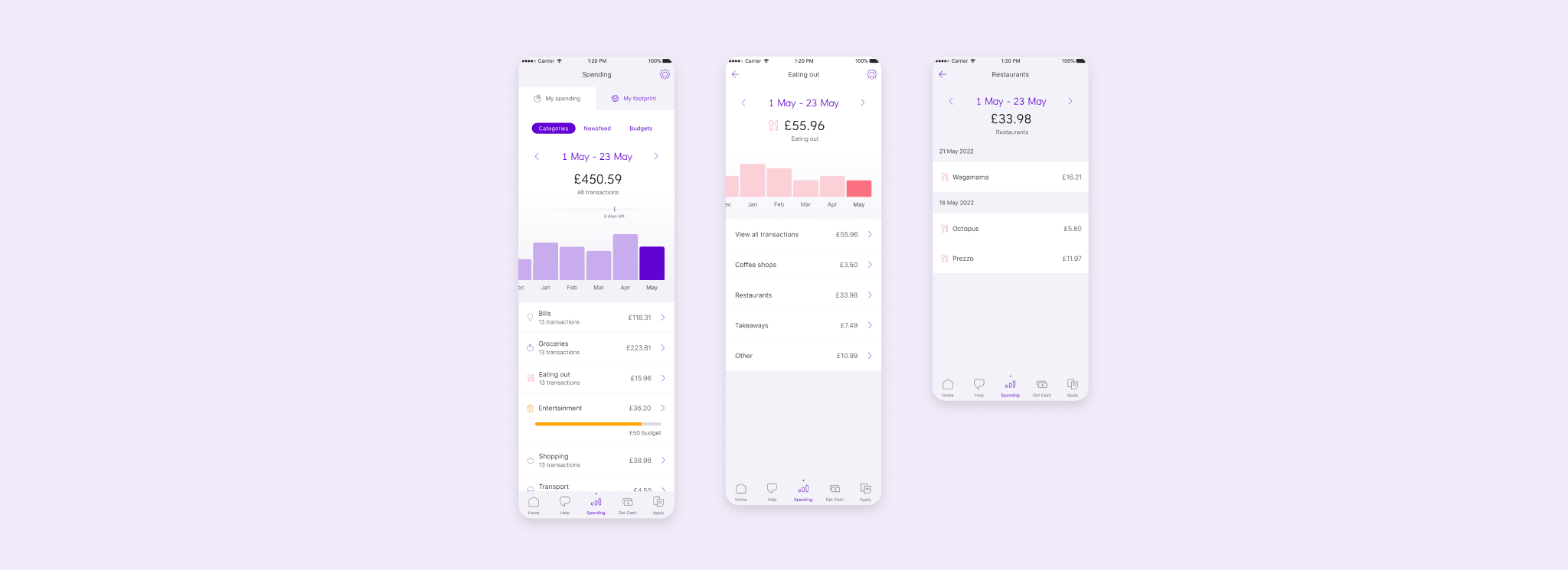
Simplifying budget indicators
Budget progress indicators were redesigned to be easier to interpret at a glance, using consistent visual language across categories. This helped users quickly understand their spending position without needing to interpret multiple competing signals.

Outcome
Increased engagement with spending insights at scale
The updated categorisation experience launched to NatWest customers and led to clear signs of increased engagement:
1.57 million new visitors to the spending tab within the first three months (+25%)
145,000 manual transaction categorisations in the first 30 days
10,100 users setting budgets within the first three months (+7%)
These outcomes suggested improved clarity, trust, and perceived usefulness of spending insights within the app.


Reflection
Using design to give users feeling of control
This project reinforced the importance of designing for confidence as much as functionality, particularly in financial products where ambiguity can quickly undermine trust.
Working within the constraints of third-party systems highlighted the value of early technical alignment and clear communication around limitations. The next iteration of this work would explore more personalised guidance over time, helping users proactively understand and adjust their spending patterns based on behaviour.
Testimonial
"We were pleased with how she approached the project and how quickly she grasped the task. She then presented the results of her exploration to all the designers on the Mobile team including the design manager (client). General feedback was the thoroughness of her exploration and the rigour of approach was better than some more experienced designers.”
- Agile Program Manager