Team
2 designers
5 client stakeholders
1 product owner
My Role
UX & UI Design Copywriting Brand Design
Industry
E-commerce
Duration
Various
How might we introduce brand partnerships into the mobile app without compromising the existing student seller experience?
Discover
One key business problem highlighted by the founder is that we were not meeting our target in sales through the app. While in-person events were successful and number of transactions was high, the asynchronous shopping via the app wasn't reaping the same results.
After some semi-structured ethnographic research from our founder at Hazaar events, one insight was that the browsing and searching experience wasn't as engaging or easy to use as they experience in other marketplace apps.
Using a test & learn design approach, I worked quickly to come up with ideas based on my own expertise and desk research, and then put designs in front of users to make improvements that were in-line with their needs.


Design brief
Leverage existing platform investments to deliver a hybrid, technical solution for Nissan's Parts & Accessories platform, prioritising customer experience without sacrificing business needs.
Enhancing the experience
In order to close deals with brands, there were several requirements that were needed to implement in the app.
Verified seller identifiers
RRP
Merchandised tiles
Time-dependent notifiers
Dedicated brand destination
All of these components were agreed collaboratively with prospective brands, the Hazaar team and design to incubate the MVP brand experience in the app.
User Journeys
Final designs
As a result of multiple iterations and collaborative decision-making sessions with the wider Hazaar team, we arrived at a new strategy for brand implementation which is functional, yet enticing. It is woven into the fabric of the existing app structure to cater for Hazaar's strategic shift towards brands without overriding other elements in the app.
Key design decisions

Optimised headter
A requirement for the new technical design was to implement a Nissan Global header along with the SimplePart e-commerce platform header, evidencing benefit for both business cases.
A stacked header with additional functionality enables users to easily access frequently-used pages on the website. Going with a more compact design does not distract from the primary browsing experience, but is still visible to the user.

Meaningful calls to action
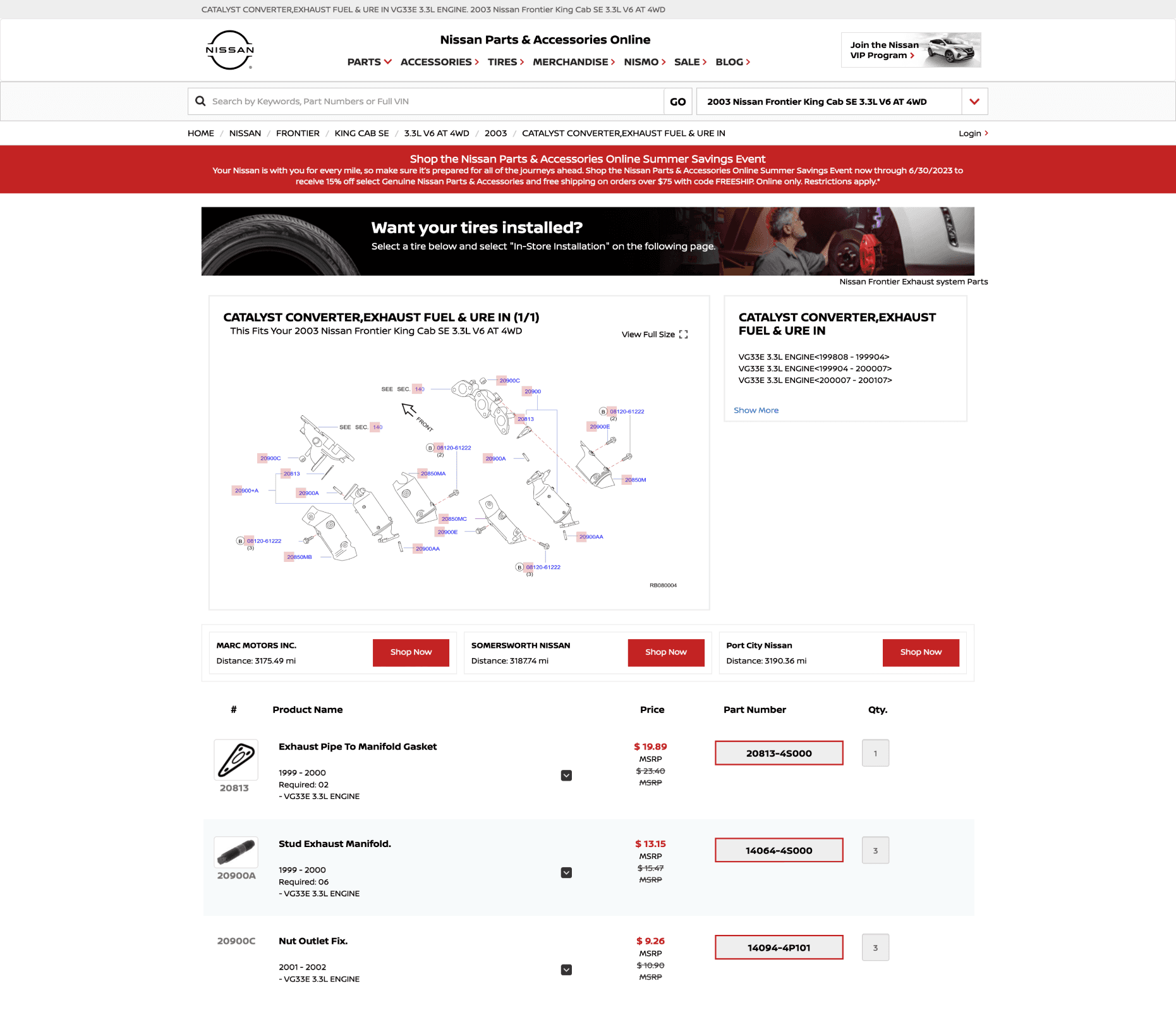
On the live site, the 'featured products' cards were outdated and not very easy to understand. One of our greatest concerns was using the part number as the call to action label, a decision made my SimplePart to boost SEO, but poses several experience and accessibility problems.
After a lot of discussion on the matter, the Nissan team were able to successfully convince SimplePart (most importantly, the CEO) to put experience at the heart of the product. My role on this journey was to provide evidence and justification for more meaningful call-to-actions, and do so with conviction in high-pressure meetings.

Recognition rather than recall
Users shouldn't have to rely on their memory when completing tasks using web interfaces, as this could add to cognitive load and creates greater chances of error.
In the example below, the first WIP design for changing your dealer from one to another was purely a notice to confirm the change. Adding dynamic text here to replay the new dealer to the user before making the selection, and highlight other important information that may impact their decision means the user is completely informed and therefore in control. This helps to minimise error and reduce task time.

Frictionless vehicle selection
The vehicle selector in the live site is clunky and requires the user to make 4 different selections, refreshing the page each time. Further, there was no option to backtrack to adjust previous selections or easily change the vehicle once it had been selected.
Simplifying this experience by providing dynamic drop-downs allows the user to provide the same information but with a lot less friction. A cleaner interface also speeds up the process as the user is familiar with the design pattern after completing the first field. Displaying a second option to type in their VIN (registration plate) gives the user freedom of choice, which in this case reduces the number of steps needed to achieve the same outcome.

Accessibility gudiance for deverlopers
In some cases, our design suggestions were not able to be implemented due to the rigidity of the SimplePart platform. Focus order in the example below was a key concern, as the screenreader doesn't currently provide any context when focused on the 'select' button.
By providing accessibility documentation for components that need additional consideration, we can ensure that users with additional needs can still experience the website in a meaningful way.