The Survivor Project
Empowering survivors of domestic abuse to seek help confidently without compromising their safety
Team
2 designers
3 developers
3 project managers
My Role
UX & UI Design Copywriting Brand Design
Industry
E-commerce
Duration
6 months (ad hoc)
How might we introduce brand partnerships into the mobile app without compromising the existing student seller experience?
Discover
One key business problem highlighted by the founder is that we were not meeting our target in sales through the app. While in-person events were successful and number of transactions was high, the asynchronous shopping via the app wasn't reaping the same results.
After some semi-structured ethnographic research from our founder at Hazaar events, one insight was that the browsing and searching experience wasn't as engaging or easy to use as they experience in other marketplace apps.
Using a test & learn design approach, I worked quickly to come up with ideas based on my own expertise and desk research, and then put designs in front of users to make improvements that were in-line with their needs.
Define
Due to time constraints, a hackathon style design sprint was conducted to rapidly research, ideate and deliver designs based on the requirements, existing design patterns and technical limitations.
A process of competitor analysis, identifying user needs, rapid ideation and collaborative reviews helped to refine ideas at a fast rate.
A mobile-first approach
Some key challenges in this process included injecting new elements to the design in a way that was easy for users to understand, adapting existing student listings to maintain consistency with new elements for brands, and working around the existing information architecture to accommodate for brands which aren't bound by category.
Outcome
As a result of multiple iterations and collaborative decision-making sessions with the wider Hazaar team, we arrived at a new strategy for brand implementation which is functional, yet enticing. It is woven into the fabric of the existing app structure to cater for Hazaar's strategic shift towards brands without overriding other elements in the app.
Mobile

Desktop
Key design decisions

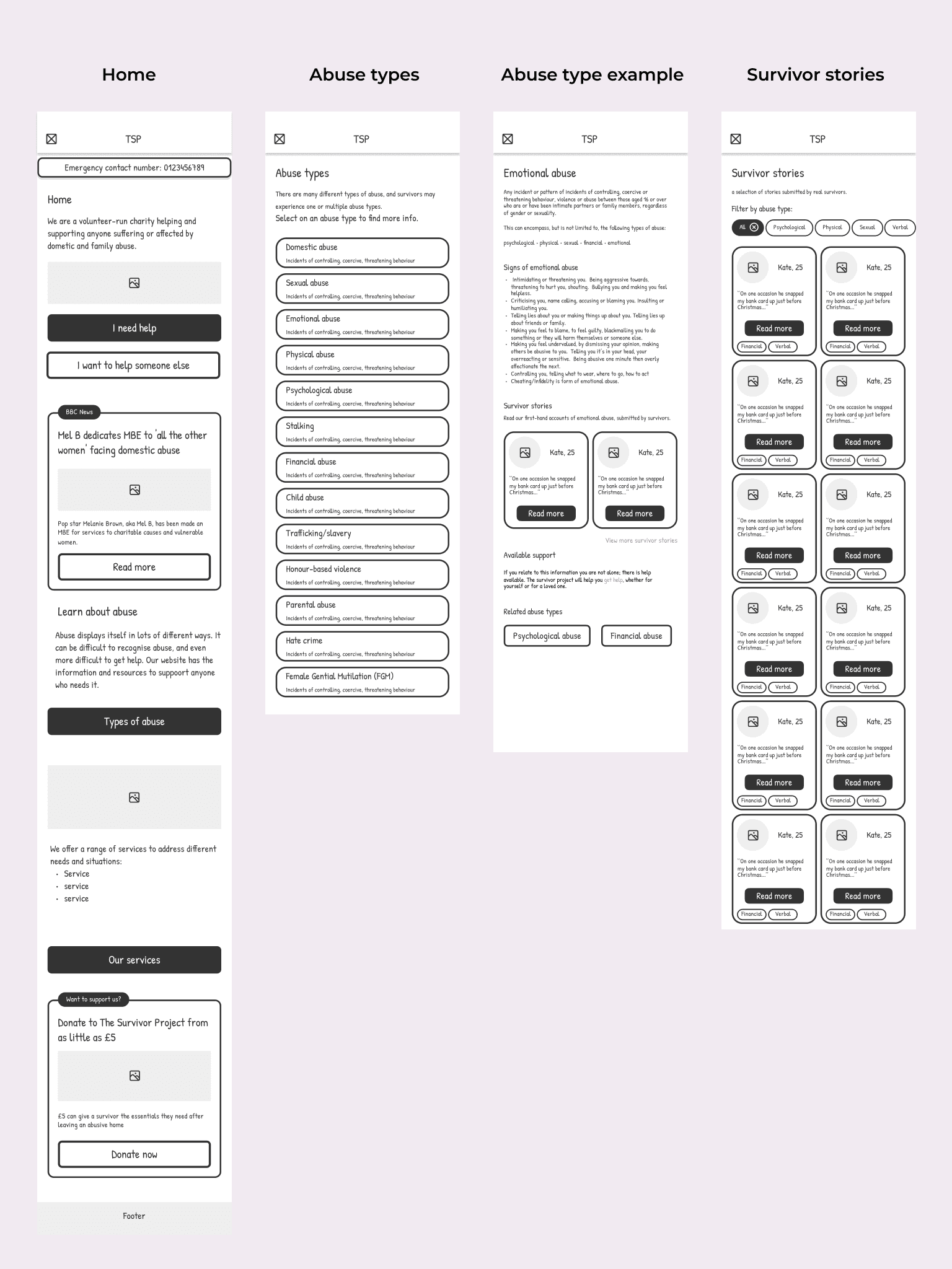
Enhanced site-map
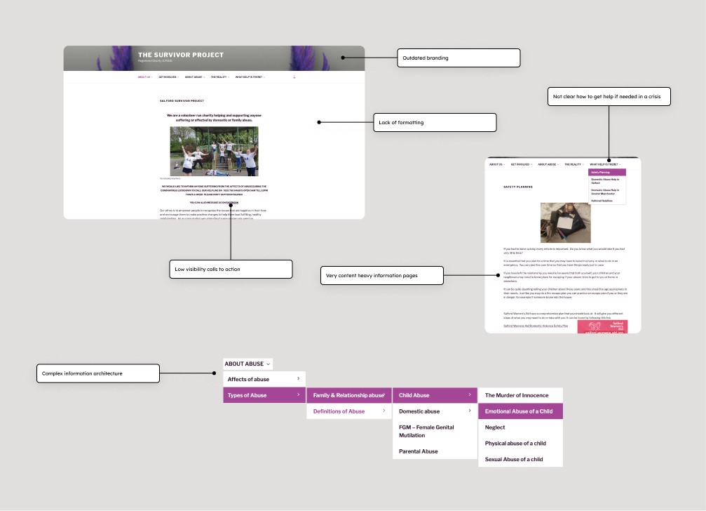
The initial website was disorganised and non-intuitive. Finding important information wasn't easy to find, and some pages didn't have any content in them at all.
By digging deeper into what the needs were of each of our core users, we improved the information architecture to best serve the needs of those in crisis, or those who are in need of support. It was important to think about how each page is relevant to each other, and how one page of content could spark curiosity or realisation to continue reading, or ideally to take action and seek help.

Donation functionality
Building out a donate feature in the website that lives in the navigation bar of the website draws the eye towards the button. Once the user is on the page, immediately the user learns about the value that different amounts of money can bring to a survivor and their loved ones, making the experience of donating money online more tangible.
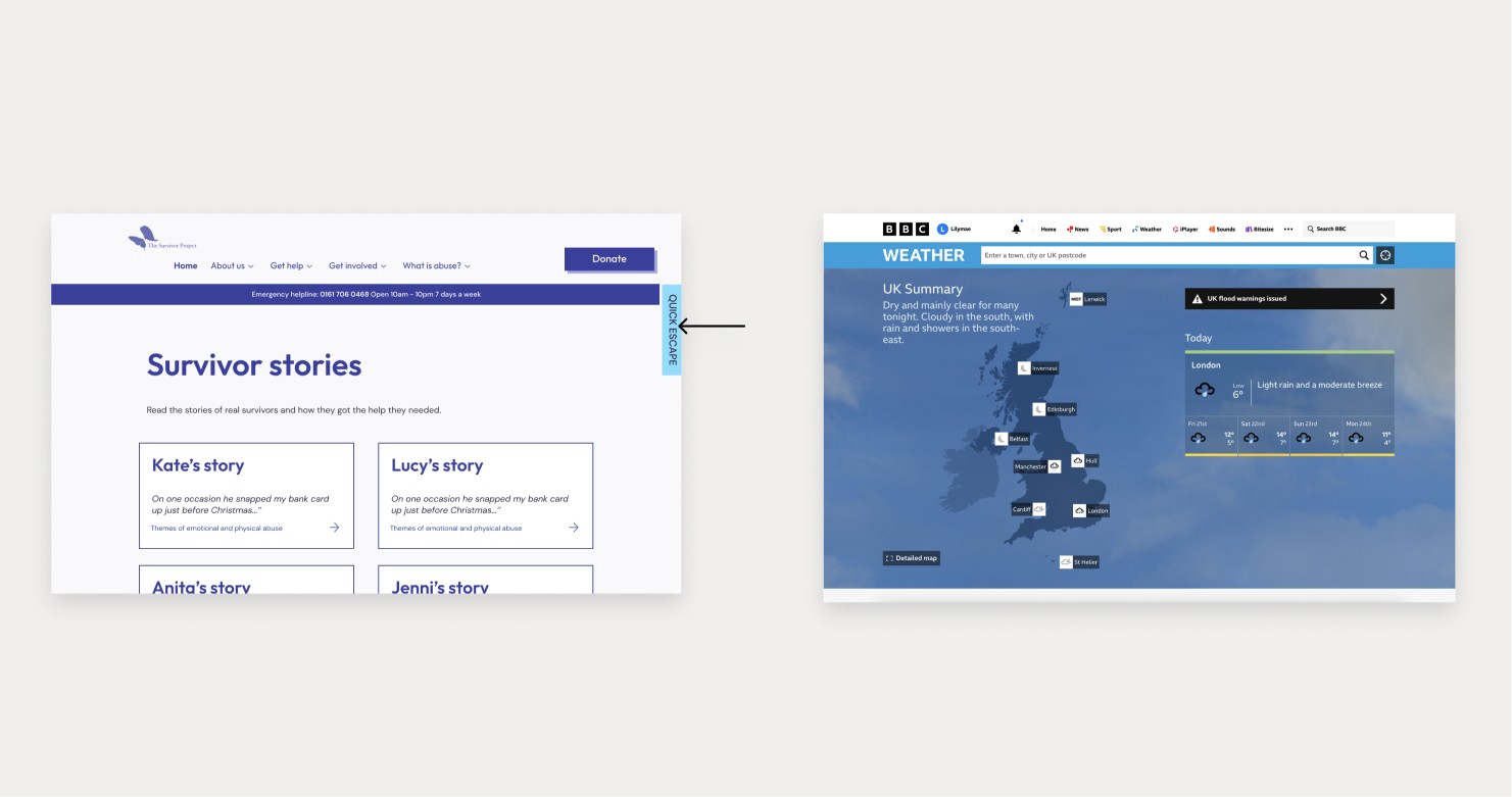
Quick escape
No matter what device they're on, survivors of domestic abuse could be in a very dangerous position if they are caught browsing support websites by their partner. It was crucial for us to implement a 'quick escape' function that is visible on every page at any scroll position so that users can exit the page without compromising their safety.
By clicking the quick escape button, the users are taken to the BBC Weather website and their history for that session is erased, meaning they don't leave a trail that their abuser might find later.

Entry-points for exploration
The platform needs to serve users at different stages of awareness. Considering that there would be users would be in a stage of denial when using the website, it was important to consider the pathways the user could take through the website to be well informed enough to reach the awareness and realisation stages from thinking about their own experiences.
Below is just one example of how a user visiting the site for the first time could potentially experience the different stages of this cycle. The reality of the situation is that it is a lot more complex, but the goal is that The Survivor Project's website is the 'lightbulb' moment for as many people as possible. Therefore, through these journeys, it was important not only to be informative, but also create a platform that users can trust and feel safe using. Embedding survivor stories allows users to relate their own experiences to others, and empathise with the struggles but also how they got the help they needed safely.

Tone of Voice
Tone of voice was a key aspect of our design process. Striking a balance between sounding friendly but also trustworthy was a priority when building out the experience because this increases the likelihood of survivors feeling comfortable with acknowledging their abusive relationships and ideally, feeling comfortable with seeking help.
Using first person narratives for headings such as 'I need help' and 'I want to help someone else' helps users to resonate with the content based on their own lived experiences, adding a layer of personification.
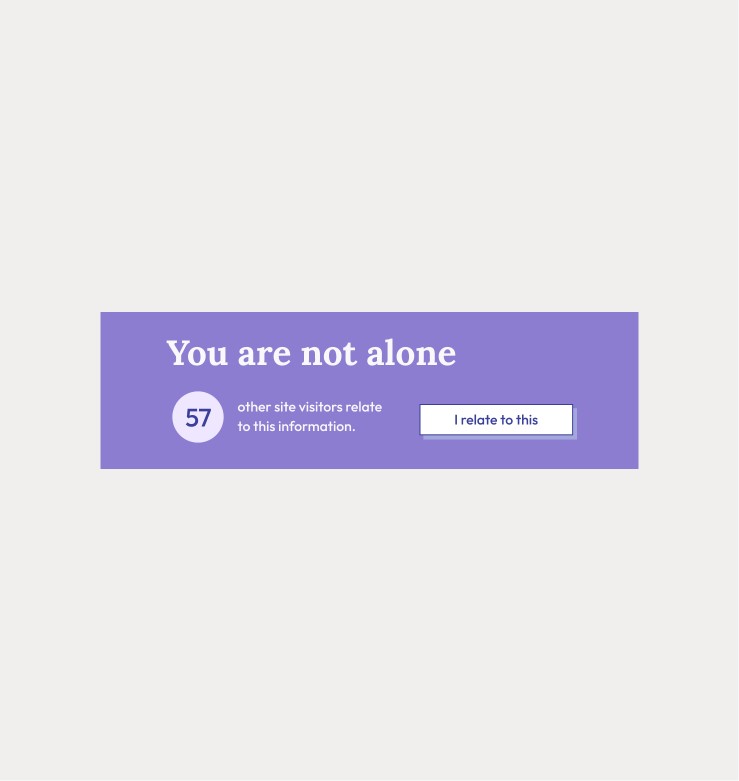
Relatability counter
In the context of domestic abuse, the mechanism of social proof is nuanced in the sense that some people reading other survivor's stories, for example, may be in an abusive relationship but not yet realise it.
Adding a relatability counter helps those in the contemplation stage to self-validate their feelings, and feel a sense of control in signalling to others that they feel the same way without leaving a digital footprint that could leave them in a vulnerable situation, like a lot of forums would do.