Sky Sports
Enhancing existing red button journeys with meaningful signposting to aid comprehension
Team
1 UX Designer
1 UI Designer
1 Product Manager
1 Copywriter
1 Researcher
My Role
UX Design
User Research
Industry
Sport
Duration
1 month
The Brief
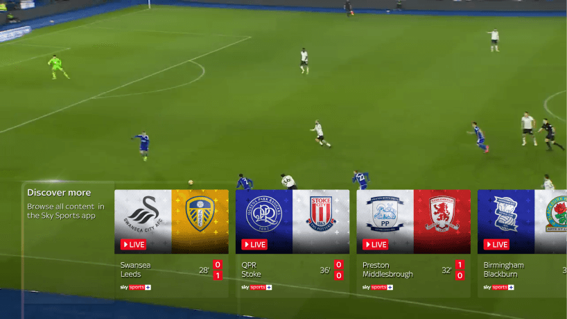
60% of customers are not aware of the existing TV app, which currently sits as a sidebar companion app experience. The only way for users to get into this today is by pressing the red button when watching an event on a Sky Sports channel, as shown below:

Hypothesis
With the new full screen TV app launching in summer 2024, there is concern that this lack of awareness of the current app is going to transcribe to the new experience, and this could result in a lack of engagement.
Why is this important?
The business cares because…
A lack of awareness could result in a lack of engagement.
A lack of engagement results in lower viewership.
Lower viewership has implications for rights acquisition in the future, and relationships with governing bodies and institutions, such as the Premier League and F1.
It's important for our users because…
A lack of awareness of the app and its features means that users don't have the full picture of what they can access through their Sky Sports package.
Merchandising an experience that isn't intuitive or usable could also cause disruption to their viewership experience, which may lead to frustration.
Understanding the problem
To dig deeper into the anticipated challenge and explore opportunities for improvement, I carried out a number of explorative activities:
Competitor analysis: to understand whether this is an interaction that exists in other spaces, and if so, how this has been handled. As made apparent from my research, this concern was unique to Sky.
Heat maps of existing screens: to understand whether visibility of existing red button triggers could potentially be a barrier to comprehension in future.
Talking to insight teams: to understand the experience as it is today and whether existing data could paint a picture of existing behaviours. A key insight that came out of this was that 40% of app users end the session immediately (by pressing the home button on the remote) and 60% of exited users reopen the app straight away. This suggests the journeys aren't clear to users, or they've exited unintentionally.


Identifying a problem to solve
Since the initial brief for this project focused on a business need of raising awareness of the app to keep users within the app, the prior phase helped to uncover where the user pain-points in the journey may be, and gaps in the experience that may need filling to ensure the journeys are as clear as possible.
HMW…
make users aware that a world of content exists in the app?
HMW…
create shortcuts to other events from a playback experience?
HMW…
gamify the existing red button experience?
Brainstorming workshop
To generate a diverse range of ideas to tackle the challenge, I planned and executed a brainstorming workshop with other designers, product managers and developers to address the how might we's above.
As a result of this session, ideas were prioritised against the key user needs and business goals in terms of effort and value.

Concept exploration
The strongest ideas based on perceived value and feasibility were explored further, looking at the opportunities each brought to meaningfully guide the user at each stage of the journey without being intrusive of the viewing experience.
I worked closely with our UX copywriter at this stage to explore the narrative of each design element and its impact on users comprehension when perceived in isolation and as a holistic experience when considered as part of the end-to-end journey.

Research approach
Phase 1 - Unmoderated research
This phase of testing focused on two key areas: comprehension and expectation.
50 users were show a series of screenshots, each with a concept for an onward journey embedded in the interface. Users were asked to explain what actions they believed they could take from that screen, and what they understood a certain element to mean if they were to interact with it.
This gave us an initial understanding of perceived value, and whether when taken out of context, the components were understandable.
As a result of this phase, some concepts were dismissed whilst the strongest were refined and implemented in an end-to-end prototype for a moderated round of research.
Comprehension
“There are multiple games happening at the same time, and you can toggle between live matches at any time.”
Expectation
“It would take me to a selection screen where I could view different games.”

Perceived Value
“..it would save me time from going back to the program schedule.”
Phase 2 - Moderated research
This second phase focused on the holistic end to end journey, including marketing emails that users will be receiving as part of the Sky Sports+ launch. Each concept was embedded into 4 different tasks of a high-fidelity prototype, which was then connected to a Sky Glass TV to replicate a realistic experience in the home.
Six participants took part in this study, each completing a set of tasks which took them through the journey of starting in the homepage of Sky's Entertainment OS, and making their way into the app via the red button.
A few stand out metrics we wanted to identify as a result of this research were the following:
Task completion - how many users could complete the tasks with very little hesitation?
Home button presses - we know from our data insight that pressing the home button is the most frequent method to exit an event and pick something else to watch, which takes them out of the app. Through these signposts and trigger concepts, we wanted to see whether these would encourage users to stay in the app and prevent them from pressing the home button.
Orientation - when asked at various stages of the journey, can users clearly and confidently articulate what platform they are on, and what they can do next?
Entry-points - through the interstitial screen, can users accurately recall the different entry-points into the sky sports TV app, even though they are only ever asked to enter via red button in the tasks?


Insights
Lean on learned behaviour first
The tasks involving the red button trigger and back button trigger were completed with 100% task success rate, since these are existing learned behaviours.
However, the implementation of signposting helped users to better understand what exactly these actions were going to result in, which were received with positive sentiment.
Positive friction is helpful for first-time users
Introducing an interstitial screen was a concern within the design team initially, since it is a general principle to design with as little resistance as possible.
In the context of a complex proposition, however, this interstitial screen to educate users on how they can access the app tested extremely well, with all participants being able to actively recall all three app entry points when prompted later on in the research session, despite not drawing attention to it during the actual point of interaction.
Minimise intrusion during live stream
Concepts that were most noticeable, easiest to understand and more appealing for users to interact with were at points of least interest during the event itself, such as just before or just after an event.
When the event is the most important thing to a user, any signposting during this time, no matter how prominent it is, becomes irrelevant to users.
Timing of these prompts is the most important thing.
Refining concepts further
As a result of the testing, four key design elements have been taken into further iteration to refine them ready for build.
Each component is specific to a particular point of the journey to give guidance in a contextual and timely way. In isolation, they help to provide prior information about where a user is expected to lead next, and in tandem, reinforces the narrative that the red button takes users into a new app destination.
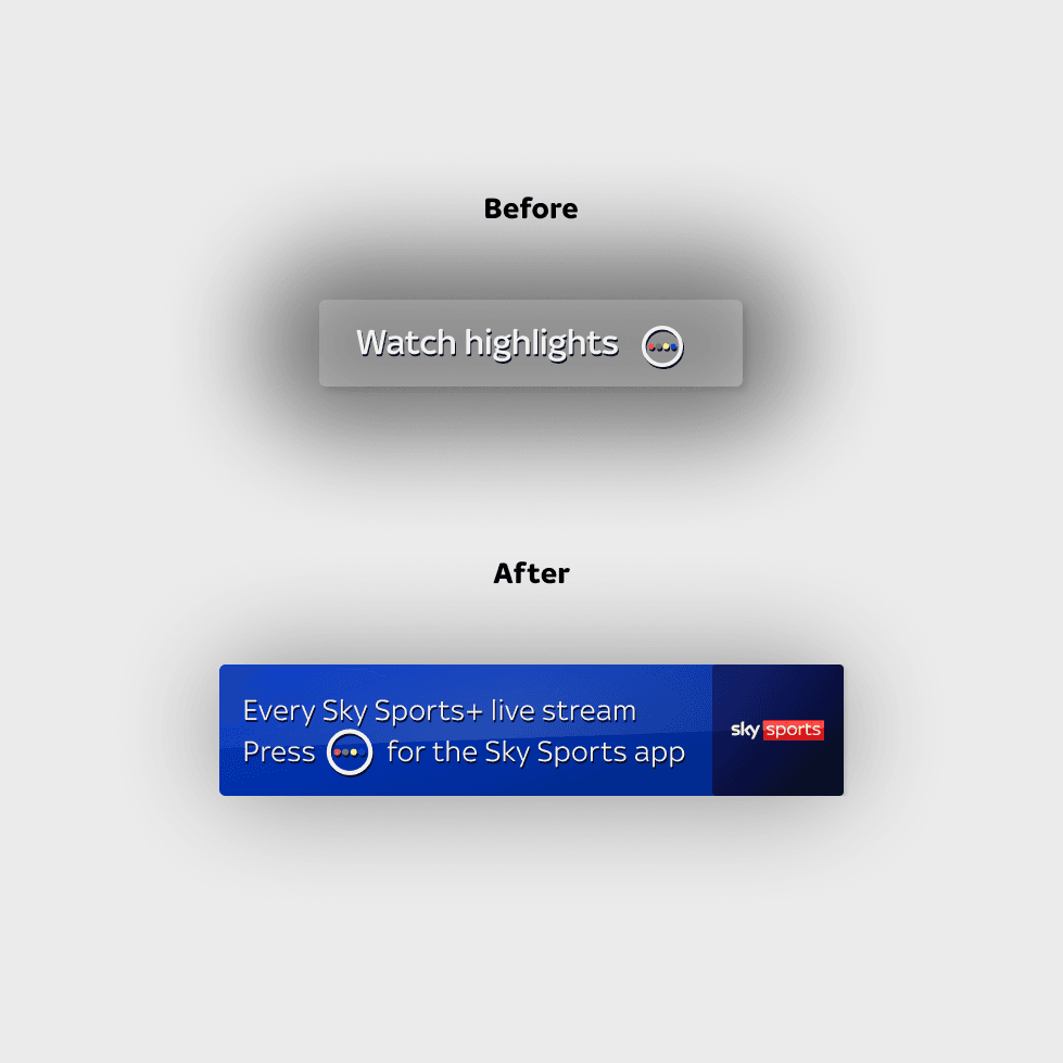
Enhanced red button triggers
Bolder design for better visibility when overlayed over broadcast
Opaque background for visibility
Meaningful copywriting, telling the user where they can expect to end up if they press the red button

Onboarding screen
Creates separation between linear TV and app when users press red button to go from one to another
Informs user of other possible entry points beyond red button

Back button triggers
Timely trigger to appear in the last 5 minutes of a stream, when an event is coming to an end or the punditry is rounding off
Indicating where the back button will take users helps to create an expectation and reduce confusion once pressed

Continue watching screen
Surface personalised recommendations and other live events helps to keep users engaged, preventing them from pressing the home button.
Surfacing features such as recap and tables enables users to use features post-live
Next steps
As a result of the research, a playback was shared cross-functionally to build the strongest of these features into the product launch roadmap. Since the MVP of the TV app has not yet been released, there aren't any metrics to illustrate the success of these features in the real world. However, with validation from the user research sessions, and approval from product and tech stakeholders in the product team, these features have received buy-in to be implemented as a fast-follow from MVP.