Duration
8 weeks
Team
1 UX Designer
3 Experience Managers
My role
Leading the UX & UI direction including ideation, decision making & documentation
Platform
Mobile

Design opportunity
With the cost of living rising, customers were paying closer attention to their spending. NatWest saw an opportunity to help users gain control over their finances by enhancing their ability to categorise and understand where their money was going.
We were brought in to improve the categorisation feature in the app, helping users assign, view, and manage transaction categories in a more digestible and actionable way. This included both automated and manual categorisation, as well as budget tracking.
Design had to work around constraints from a third-party provider powering the categorisation logic, requiring close collaboration with tech while advocating for user needs.
Before getting to the good bit, here's some stats to demonstrate the scale and impact of this work:
1.57m new visitors
in the spending tab in the first 3 months (+25%)
💸
10.1k users setting a budget
in the first 3 months (+7%
145k manual categorisations
in the first 30 days
📊
Process
An audit of the current experience and carrying out competitor analysis helped to identify gaps in the experience or opportunities for improvement in-line with the ask.
The final flow considers 4 key journeys: onboarding first-time users, assigning categories, viewing categories and recategorising. The design process also took into consideration the presentation of data and unhappy paths.
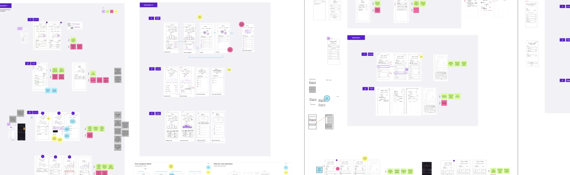
Consolidating journeys into a single flow
We focused on streamlining four key flows: onboarding, assigning categories, viewing spend breakdowns, and recategorising. I mapped how each journey would connect and evolve over time to help both users and stakeholders see the bigger picture.

It was important to understand how the four key journeys were going to intertwine with each other. Iterating on this helped to bring clarity in the core functionality of each screen when designing the experience of the interfaces themselves.
The mid-fidelity wireframes and journeys were finalised and signed off before moving onto high-fidelity screens. These were created in Sketch using design system components, and then reviewed by a UI designer to ensure that the screens were consistent with the rest of the app's design patterns
Onboarding flow
A new flow was defined to introduce customers to the feature and give them and allow them to try it out and learn how to use it. This helps users get familiar with the new categories experience.
Improving usability through micro-patterns
To reduce friction, I introduced new design elements including tooltips to onboard new users, arrows to navigate the chart for easieraccessibility, accordins to avoid overhwleming lists and consistent budget indicators to clarify progress at a


Improved consistency at a glance
The architecture of the previous budget indicator was inconsistent, meaning users weren't able to comprehend their progress easily.
Revising the structure to be consistent, whether a user has set a budget or not, means that users can quickly interpret their spending in relation to their budget, reducing cognitive overload.